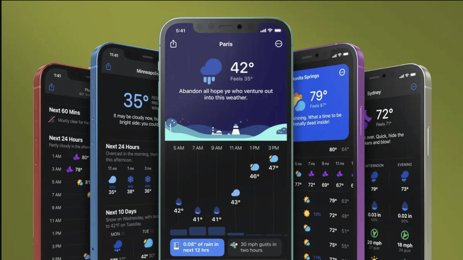
Weather apps have gotten impressively good. Seven-day forecasts are now about as accurate as three-day forecasts were twenty years ago, and hourly temperature predictions for the next 24 hours are reliable enough to actually plan around. But the single number on your screen, the temperature with a little cloud icon underneath it, leaves out information that can matter quite a bit depending on what you are doing.
Here is what the app is not telling you, and why it matters.
The “feels like” temperature is calculated for a very specific person
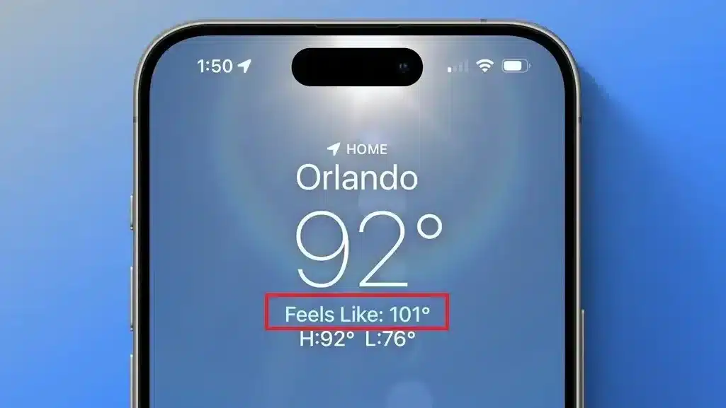
The feels like or apparent temperature on your weather app is either the wind chill index in cold weather or the heat index in warm weather, and each formula was built around specific assumptions that may not match your situation at all. Wind chill is calculated for a person walking at 3 mph into the wind. If you are standing still in a sheltered spot, it will feel warmer. If you are exposed on a rooftop or in a wind tunnel between buildings, it will feel colder. The number on your app is not an average of those situations. It is one specific scenario.
The heat index assumes you are in the shade and not exercising. Direct sunlight in summer adds 10 to 15 degrees Fahrenheit to what your body actually experiences, which the heat index does not account for. A heat index of 100°F in direct afternoon sun with physical exertion creates physiological conditions significantly more dangerous than the number implies.
Both metrics are also about sustained exposure rather than immediate danger. A heat index of 105°F means conditions that will cause heat exhaustion in the average person after prolonged exposure, not in five minutes. How long and how much depends on your age, fitness, acclimatization, clothing, and hydration. The app’s single number is a starting point, not a complete picture of your personal risk.
The precipitation percentage does not mean what most people think it means
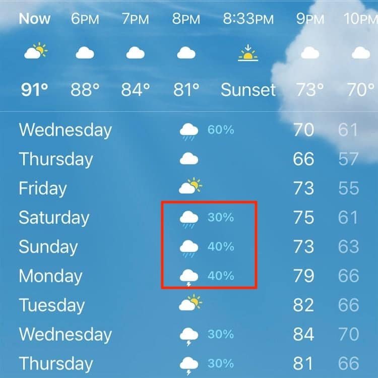
There is a persistent and widespread misunderstanding about what the percentage on a rain forecast actually means. A 70 percent chance of rain does not mean there is a 70 percent chance you will get rained on at your specific location. It means there is a 70 percent probability that measurable precipitation will fall somewhere in the forecast area, which might be your entire county or a larger grid cell, at some point during the forecast period. That is a very different thing.
That 70 percent could mean scattered showers affecting 70 percent of the area, or a 70 percent chance of a widespread event that hits everywhere, or various combinations depending on the storm setup. The number says nothing about how hard it will rain, how long it will last, or whether the rain will fall during the specific three-hour window you are planning to be outside. The brief window matters as much as the daily total.
For timing and geographic precision, the National Weather Service’s hourly graphs and radar are more informative than the single-number probability on a consumer app. Looking at radar the morning of your outdoor event is more useful than checking the rain percentage the night before.
The temperature is measured six feet above open grass
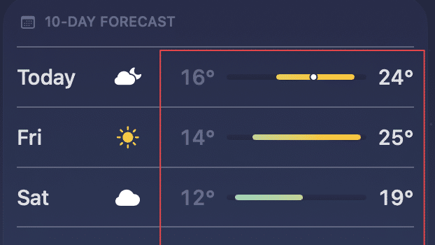
Official temperature readings, and every forecast based on them, are measured at approximately 5 to 6 feet above the ground in a shaded instrument shelter over natural grass or soil surface. What you actually experience depends heavily on where you are and what is around you. An asphalt parking lot on a sunny afternoon can be 40 to 60 degrees hotter at the surface than the official air temperature measured six feet up. A south-facing concrete wall radiates absorbed heat all afternoon long. A clear night with low humidity allows the ground to radiate heat rapidly, meaning surface temperatures can be 10 to 15 degrees colder than the official low, which is why frost forms on calm clear nights when the official low is 37°F.
Urban areas experience the heat island effect, where the concentration of dark surfaces, waste heat from buildings and vehicles, and lack of vegetation makes cities measurably warmer than surrounding countryside, especially at night. The official city temperature reading is your best reference if you live in a dense urban area. If you live in a valley, on a hilltop, or near a body of water, local variations can be substantial enough that a personal weather station gives you more actionable information than the official forecast for your specific location.
The wind gust forecast is probably a minimum, not a maximum
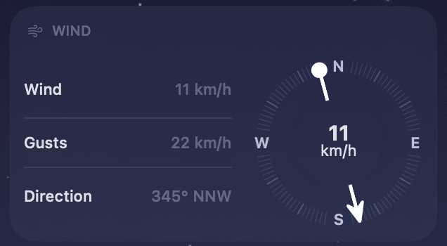
Most weather apps display a wind speed and a gust range, but the forecast gust value is typically a deterministic best estimate rather than the upper end of what is possible. Gusts in complex terrain, near coastlines, or in the presence of convective storms can significantly exceed the forecast maximum in localized areas. A forecast of winds 20 to 30 mph with gusts to 45 mph does not guarantee that gusts will not briefly reach 65 mph in a narrow canyon, on an exposed ridge, or in the outflow boundary of a passing thunderstorm nearby.
For activities where wind matters, sailing, cycling, working at height, driving a high-profile vehicle, or flying a drone, the forecast gust value should be treated as a probable minimum in high-risk terrain rather than a reliable ceiling. The National Weather Service’s area forecast discussions, which are actual text written by the forecasters explaining the reasoning behind official forecasts including acknowledged uncertainties, often contain more nuanced wind language than anything a consumer app distills from those same forecasts. They are publicly available on the NWS website and worth reading before any activity where wind is a serious factor.
The 10-day forecast is showing you one possibility out of many
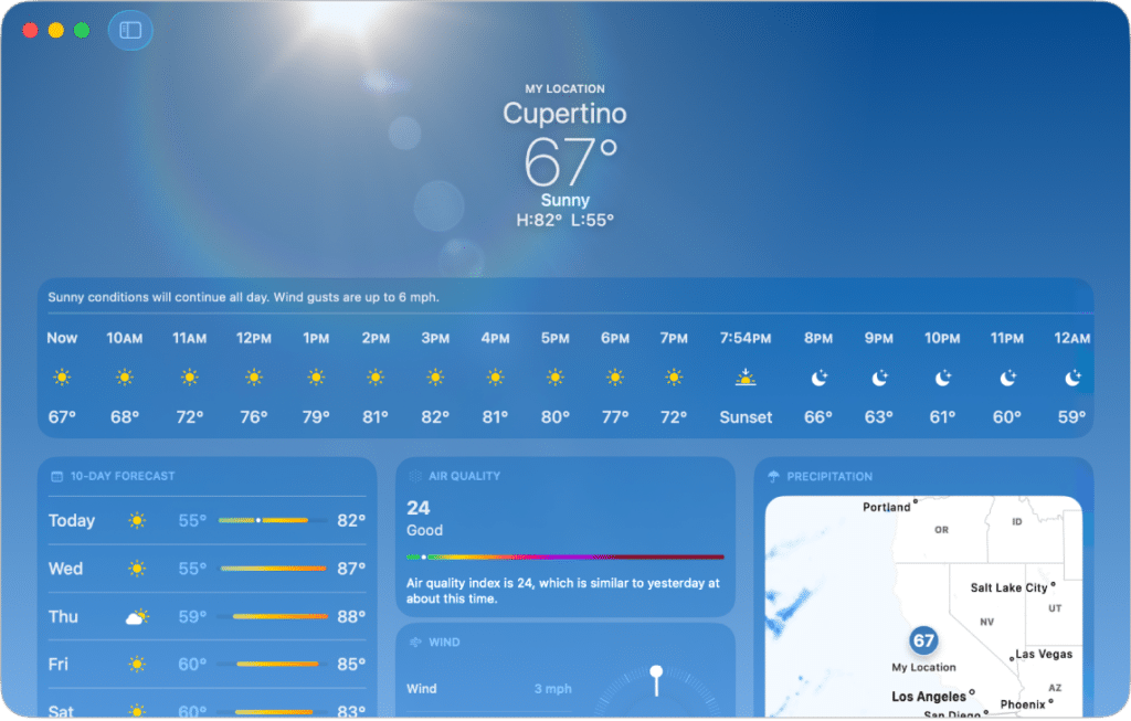
Modern numerical weather prediction runs dozens of slightly different versions of the same forecast simultaneously, varying the starting conditions within the range of observational uncertainty. The result is an ensemble, a spread of possible outcomes. When ensemble members cluster tightly together, forecasters have high confidence. When they spread widely, the forecast is inherently uncertain and the single value displayed on your app represents only the most likely outcome, not the full range of what might happen.
Consumer apps almost never show this uncertainty. A 10-day forecast showing 52°F and partly cloudy might have an ensemble spread ranging from 40°F to 65°F, wide enough that the displayed value is nearly meaningless as a planning tool. Beyond three to four days, weather forecasting is about probabilities and ranges, not specific numbers, and displaying a specific number without context can give false confidence. The further out you look, the more the specific numbers should be treated as rough suggestions rather than reliable predictions.
Apps that display forecast confidence or model disagreement, showing you when models agree versus when they diverge significantly, are substantially more useful for decision-making than apps that present a single confident number for every day of a two-week forecast. Looking at when forecasters disagree with each other is often more informative than reading what they agree on.
Air quality and UV index are often the more dangerous numbers
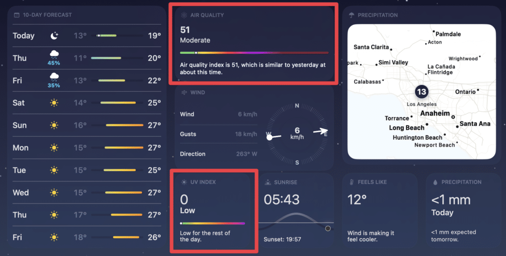
Most weather apps bury air quality index and UV index several screens deep while displaying the temperature prominently on the home screen, which reflects consumer preference rather than actual health risk. At high elevations, UV radiation can reach dangerous levels even on cool, partly cloudy days. Above 10,000 feet, UV intensity is 25 to 50 percent higher than at sea level, and snow reflection doubles the dose from below. A 60°F overcast day in the mountains can cause more UV damage in a few hours than a 90°F beach day with proper sun protection.
Air quality problems are particularly deceptive because they are invisible and odorless at moderate pollution levels. An air quality index above 150 is considered unhealthy for everyone, not just sensitive groups, and outdoor exercise under those conditions significantly increases the amount of pollutants drawn deep into the lungs. Wildfire smoke has made this problem dramatically more relevant across the western United States and increasingly across the whole country, as smoke from large fires regularly travels thousands of miles and affects cities far removed from any active fire.
Making a habit of checking AQI before outdoor exercise, especially if you live anywhere with seasonal wildfire smoke, is as important as checking for rain. The temperature can be perfect and the air can still be actively harmful to breathe during exertion.
Different apps use different forecast models, and it matters
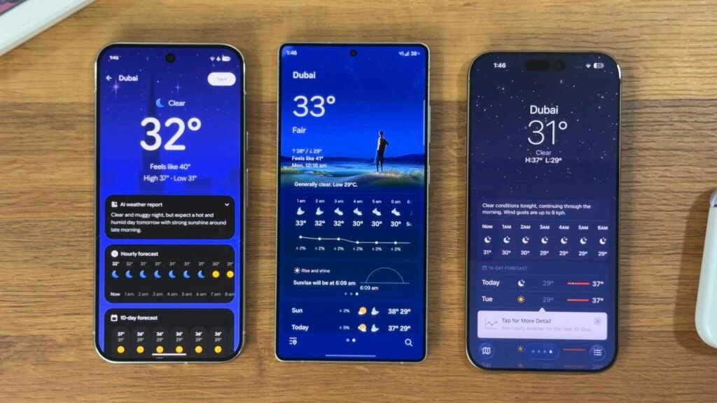
Every weather app pulls its data from somewhere, and different apps use different underlying forecast models with different strengths. The American GFS model, the European ECMWF, and the Canadian GEM model each have documented performance differences across regions, seasons, and weather pattern types. The ECMWF generally outperforms GFS for medium-range forecasting in most situations, but GFS updates more frequently, which matters during rapidly evolving events. Some apps blend multiple models and some rely primarily on one source.
The app that is most accurate for your specific location is worth discovering through experience. Local terrain, coastal proximity, and elevation all affect which model performs best for your area, and those differences can be meaningful when you are making plans based on a forecast. Apps like Windy and Weather Underground display some ensemble data and model comparison tools that make the underlying uncertainty more visible than standard consumer apps typically do.
No forecast model is right all of the time, and understanding that the displayed number is a best estimate from a computer simulation rather than a certainty is genuinely useful context for anyone who spends time outdoors. The most accurate forecast in the world is still sometimes wrong. Knowing when to trust it and when to hedge is a skill that improves with experience and attention to how often the specific app you use is actually right.